Little Old New House - Part Two
By Julie Schmale & Jessica Houston
Welcome to Part Two of this cute Little Old New House! If you can imagine with me, we’ve walked through the front entry and the kitchen/dining/living rooms of the home (if you can’t remember, you can click HERE), and now we’re heading down the hallway. First up, the primary bedroom.
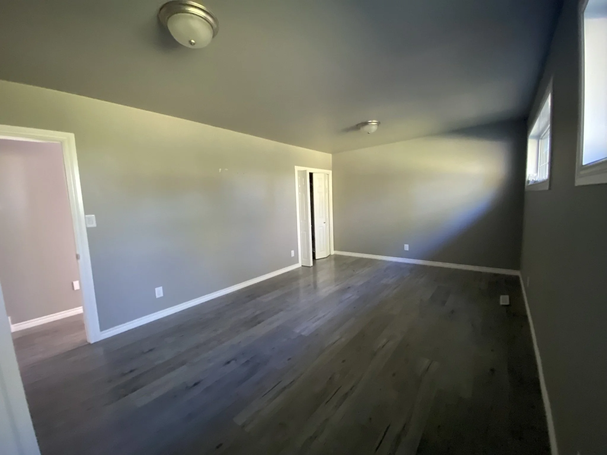
As you can see from the before pictures, this room was really nice and big to begin with. It had at one point in time been two separate bedrooms, but the wall was knocked down to create a rather long, and a bit narrow bedroom. A great size, considering this is an older home. As we walked around the space, it became apparent to us that closet space and storage needed to be amped up. The feeling we wanted to create in this space was a warm and inviting, farmhouse-feeling with quiet-escape-vibes for the owners, and there are a few key elements that we implemented to make that happen.
// BEFORE //
// BEFORE //
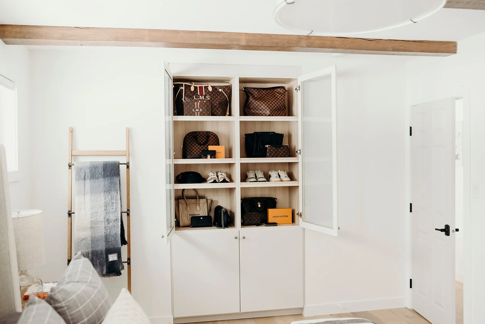
First up, beams. We wanted to install ceiling beams somewhere in the house, and because the flow of the main areas did not offer a good spot for them, we opted for the master bedroom. And we’re so glad we did! They immediately added depth and warmth to an otherwise simple room. We also combined the two light fixtures into one large pendant centered over the bed. We continued the main floor hardwood into this room, stained the beams slightly darker than the floor, and installed a feature light above the bed. All under the umbrella of creating a warm, get-away-retreat style room.
Watching this room come together and upping the functionality game with the closet system from Stor-X, was so much fun. Originally, there were two closets on opposite ends of the room, but the standard “one rod with a shelf above” closet just doesn’t give much for functional storage space. We ended up removing both of them completely! The one became absorbed by the hallway closet allowing a much deeper linen closet than what was there, as well as a deeper closet “nook” for the bedroom backing onto the master. The other closet was moved to the center of the wall, and we used half the cavity depth for a shallow glass cabinet and the other half for the fireplace in the living room. This allowed us to center the fireplace and gain square footage in the living room. Back in the master bedroom; closing off the old un-functional closet allowed us to fill the entire wall with a better closet space and storage. It also shortened the room by two feet, so it didn’t feel or look so long, and it happened to work out that this centered the bed on the windows. From a design perspective, this all helps create a room that feels and looks balanced allowing your eye to take in all the other beautiful features and textures we added. The shallow glass closet on the other side was specifically designed to show off the homeowner’s collection of purses and shoes. Because if you have such a beautiful collection, who wouldn’t want to look at them all the time?!
One of the details we added to the whole home were custom flushmount vents, made from the same hardwood as the flooring. Our installers did an absolutely amazing job at creating this seamless detail to a part of your home that is necessary. One of my favourite parts of design and working with talented people, is the ability to make what is necessary look beautiful.
Keeping with our core design principles, we mixed a lot of different textures and added in some pattern to create warmth and interest. The beautiful part of all of this, is that the room still feels serene and not overly done.
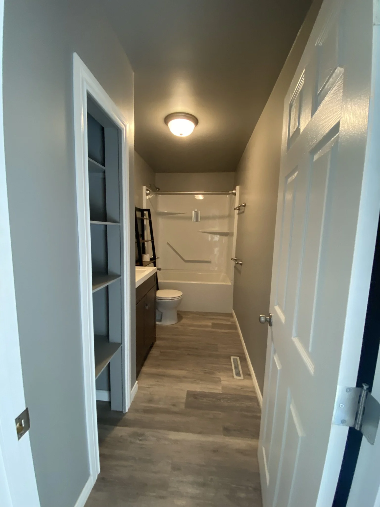
The main floor bath, is the only spot in the home with the space for a tub. And because this room is not large enough to house a separate bath and shower, keeping them combined was the best way to use the space. Again, due to the size and shape of the room (and the spaces surrounding the bathroom, we didn’t want to steal space from the kitchen or the guest bedroom), there was not a lot of option when it came to where the plumbing fixtures would sit. The one thing that we did do, was take out the open linen closet that was on the side of the vanity, to create a larger vanity with more countertop space, and lots of functional storage in the counter unit. As you can see, we couldn’t take the vanity all the way to the wall because there was plumbing stacks running from the basement to the roof through there, but instead of just drywalling it over, we decided to add the same brick that we used in the living room, just use a little less grout so that it looks like an old chimney stack. And honestly, that small detail adds so much personality into this tiny room.
A few of the other details we were able to add in, were heated floors (because stepping out of your tub onto a heated tile floor feels like heaven), tile tub surround with niches to hide away all the products that they use, and slick floor vent covers that keep the tile looking amazing. Then it was just a matter of mixing our greiges, patterns, and textures, to create a warm and inviting bathroom.
When we were sourcing and piecing together the decor for this space, we reached out to a local artist, Carla Tyacke, to commission two art pieces for us. The way the colours flow and work with the rest of the room is just beautiful and it’s always such a treat to work with local talent.
Last stop on the main floor! The spare bedroom was a super fun transformation for us to work on and we’re pretty thrilled with how it came together. Because our clients have adult children, the need for a kids bedrooms was not really there (and there are bedrooms in the basement… blog post to come!). BUT! Their first grand child was on the way, so we pitched the idea of making this a space for future grandkids! Being on the main floor it will be great for cousin-sleepovers-to-come and keeping toys away from the main living spaces.
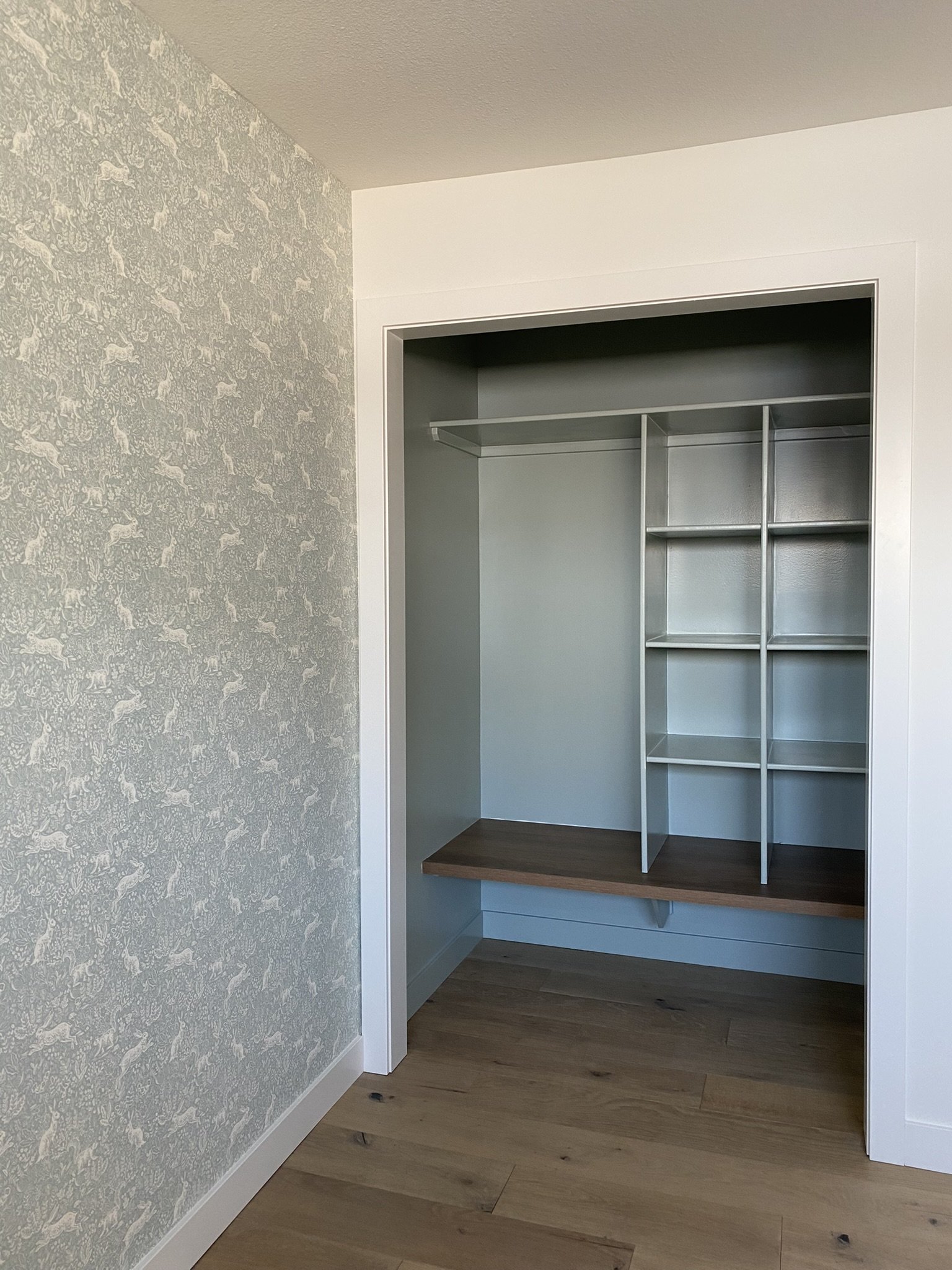
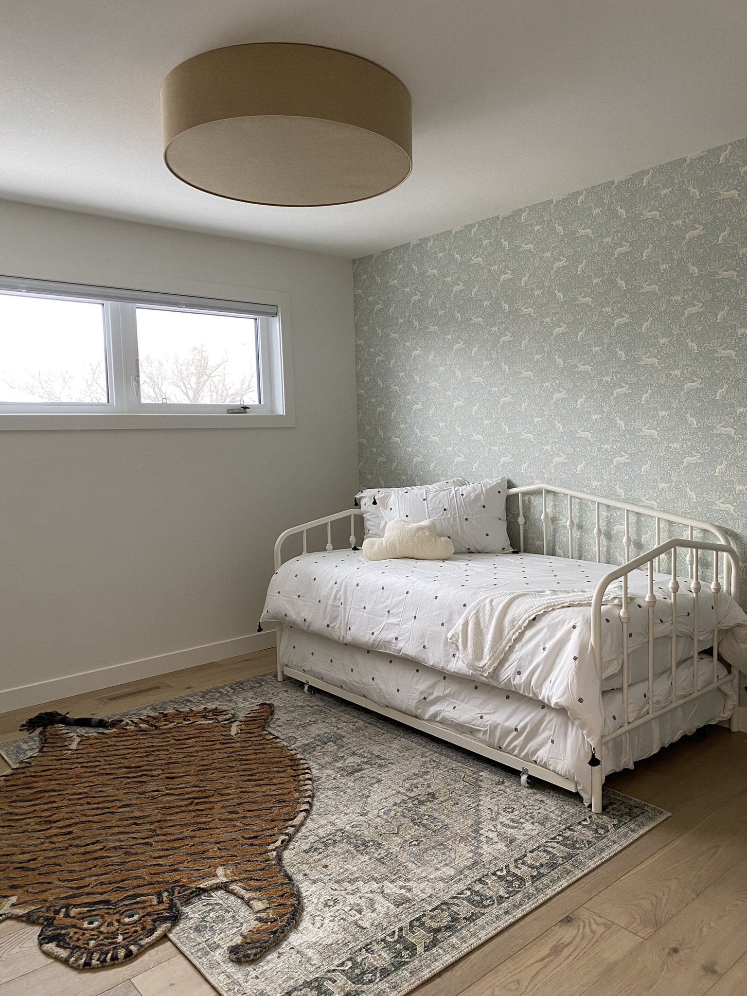
This room was a good size and very bright, so the only real adjustment we made to the layout was opening up the closet and making it deeper. Because we removed the closet from the master bedroom, it gave us extra depth to dream up a little nook, where the grandkids can eventually play, read, and store all their toys and books.
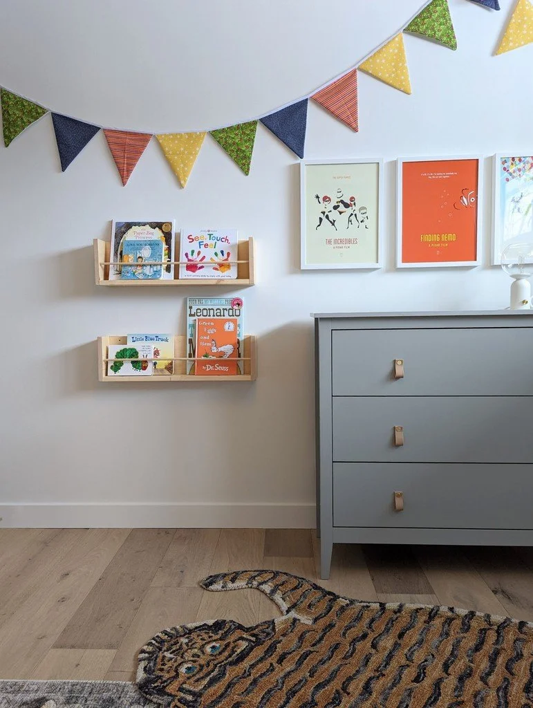
We put a lot of thought and care into the details that were added in. The wallpaper was chosen because of the fairytale-feel, colour, and pattern it would inject into the room. It helped create a soft focal point with the daybed. The open closet was painted a complimentary colour to the wallpaper, which makes it pop a little, but it still flows with the rest of the room. The storage areas and furniture chosen were all thoughtfully put together, with little people in mind. We’ve already had feedback from our clients that their little grand-daughter loves this space. The posters were chosen based on the families love of everything Disney, and we picked up accent colours from the posters and rugs to create a fun bunting flag…because what kid’s room doesn’t need a bunting flag?!
Layering the tiger rug on top of the standard rug was one of those things where we thought “will they think this is too crazy?” But as you work with clients you pick up on their personality, and this couple definitely had a fun streak to them. They loved the idea, partly because it’s different, a bit daring, and not something you see every day.
I think our favourite aspect of this room is how well it flows with the overall feel of the home, but it definitely has it’s own personality. I love that part of interior design. I love when creating separate rooms, they can have their own quirks and personalities, but flow so easily together with other spaces in the home. It definitely makes the home feel cohesive but individual.
That’s it for Part Two!! Next up is the basement….and there’s some really great transformations that happened down there :)
Shoutout’s to:
5 Point Contracting for all of the installation on this project and putting up with all of our design ideas / Winterhalt Mechanical for plumbing / J&C Stonecutters for quartz installation / Just Electric for…feels self explanatory


