Little Old New House - Part One
Welcome to what is possibly one of the cutest little old new houses around. We’ve withheld a lot information in on this project, but it’s time to show you around!
Updating this farmhouse was a way for our clients to downsize, but stay on the farm. This was a strategic move as the farming operation is a family affair and house swapping was in the mix. One of the things we loved most about working with this couple, was their very apparent love for their children and their family. Creating a home to suit their current life, but also a growing family, was an absolute necessity as they became new grandparents during this project.
The first challenge of this little home was the lack of an entryway. The current entryway was through the garage and had just a small landing with stairs leading in to the home. Because a new separate garage space was being built, we were able to take the current double car attached garage and split a portion of it into a brand new mudroom. This opened up so much more storage for outdoor clothes, shoes, seasonal gear, and any extra storage space needed.
Because it’s a hard-working room (hello muddy farm boots!) the materials for the entrance had to be durable and easy to clean. We chose flat paneled cabinetry that will be a breeze to wipe down and vinyl flooring that can withstand the extra water and mud from boots. The entryway ended up being quite long and more narrow, which gave us the ability to design the cabinets and storage to sit on one side, but left the other side feeling a bit bare. By adding shiplap to the walls, wrapping it around to the door leading into the house, we were able to add subtle detail without making the mudroom feel cramped or like you’re walking through a tunnel to get into the home.
And because we were able to add so much storage and cabinetry in the mudroom, we removed an entire closet inside the home, that visually and physically opened up the entrance and especially the staircase to the basement. This whole area felt dark and enclosed before, and these changes really opened up the space. We also added a window in the entrance to let in some much needed natural light -which again just brightens up the space.
Once you walk into the main area of the home, all of the rooms flow with quite a bit of openness for being an older home. We wanted to create a cohesive flow throughout these main spaces using neutral colours and warm tones, but also add interest to each separate space with textures, contrasting finishes (matte and glossy), and wall paneling.
The powder room pulls all the elements together. We were inspired by Chris Loves Julia with their patterned penny tile and developed our own pattern for the floor. We absolutely love it! It was also a treat to design and work with Rockside Builders on the vanity. Taking the wood fluted design on the vanity and adding in the vertical shiplap on the walls tied the two elements together without competing with one another or overwhelming the small space. Honestly, this space was a lot of fun to work in.
Creating functional space and storage was one of the goals for this home renovation, which is often times a challenge in older homes. Because it’s a smaller home, and the homeowner is cooking for large crowds (especially during harvest!), we needed to create lots of work space in the kitchen and also a large pantry area.
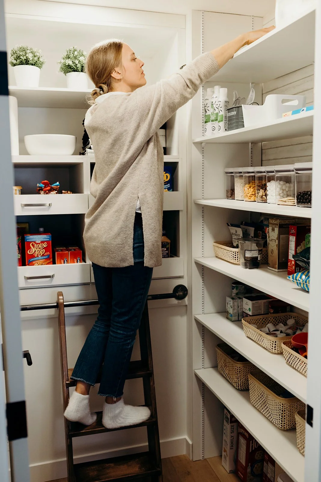
By taking what could be considered unusable space from above the staircase, we created a pantry with deep drawers, and a moveable ladder so that you can reach everything!
The layout of the kitchen did not actually change drastically, but the functionality of the cabinetry sure did. When working with clients on designing their kitchen cabinetry, functionality and daily living is essential to walk-thru and figure out with them. Creating lots of counter space for prepping and working was essential, as big meals are being made and served. This was not a huge kitchen! But by adding cabinetry that serves specific purposes, we were able to maximize the space in the kitchen, so everything has a place.
The choices made for the finishings in the kitchen were all chosen based on their overall feel, durability, and how they fit in with the rest of the home. We wanted to incorporate pieces that were warm and bright, but also held interest. The strong marble vein in the countertop provides a standout feature for the kitchen, and it accents the square variated tile backsplash so well. Add in the slightly off-white cabinetry and mix of wood cabinets and flooring, and you now have a kitchen that has numerous beautiful features that all flow cohesively together.
Next we transition into the laundry room, which sits just off the kitchen. With this space, we really wanted a different feel without going outside of the home’s overall design. We sourced a vintage door, refurbished and restained it, added a beautiful antique knob, and now it feels like a treat to walk into your laundry room!
Instead of keeping the laundry cabinetry the same colour as the kitchen, we switched it up and used a dark blue cabinetry but kept the profile and the countertop the same. This feels dramatic and really draws you into the room that is now different but cohesive.
We also applied this amazing wallpaper to all the walls. It’s such a beautiful detail that you can see whether the laundry door is closed or open. The colours and pattern are subtle but it adds such a intentional feel to the design in this room.
As in the kitchen, the cabinetry was all chosen to serve a purpose and function. We incorporated a hanging rack for air-drying laundry, which can easily be stored away when not in use. One of the fun little details we got to design was a dog bed that fits right into the cabinetry. The interior is the same wood as used on the kitchen island which provides a nice finish to the interior. We then added metal mesh to the door, and now their pup can hope into this spot anytime he likes!
Let’s transition to the dining room…
One of the challenges with open-concept homes is creating a cohesive flow while still distinguishing each space. This can be done in many different ways, but in the dining room here, some of the key elements that we used in order to distinguish the area was wall paneling, richer paint colour, different window coverings, and a statement chandelier. All of these elements dress up the dining room while remaining cohesive with the overall feel and vibe of the home.
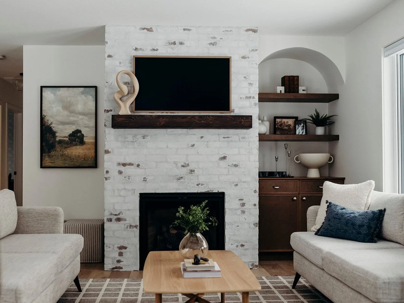
The living room came with it’s own set of challenges. We ended up moving the original fireplace chase into the center of the room (which also worked well for the shoe closet in the Master Bedroom on the other side!). This really helped bring symmetry into the room, which we played up with identical sofas and accent chairs. There were numerous elements that we wanted to infuse into the design of this room, mainly mixing lots of different materials, shapes, and textures. The end result turned out pretty great!
There were two specific things, we knew from the beginning of the design process that we wanted to incorporate. A german schmear application on the brick on the fireplace, and an arch over the cabinets. We also knew that we wanted the design of the fireplace feature wall to be asymmetrical, rather than incorporating cabinetry on both sides of the chase. We love how each side of the fireplace is different but complimentary of one another. It was pretty fun working and mixing up symmetry in this room. Keeping the furniture symmetrical really helps keep the room feel calm while the fireplace feature wall throws in more interest because of the different elements that it includes.
That’s Part One! There are are still a lot of different spaces to show you and walk you through. Can’t wait to show you the rest of this cute little home.


