Ugly Room Makeover
By Julie Schmale
What could your UGLY ROOM look like?

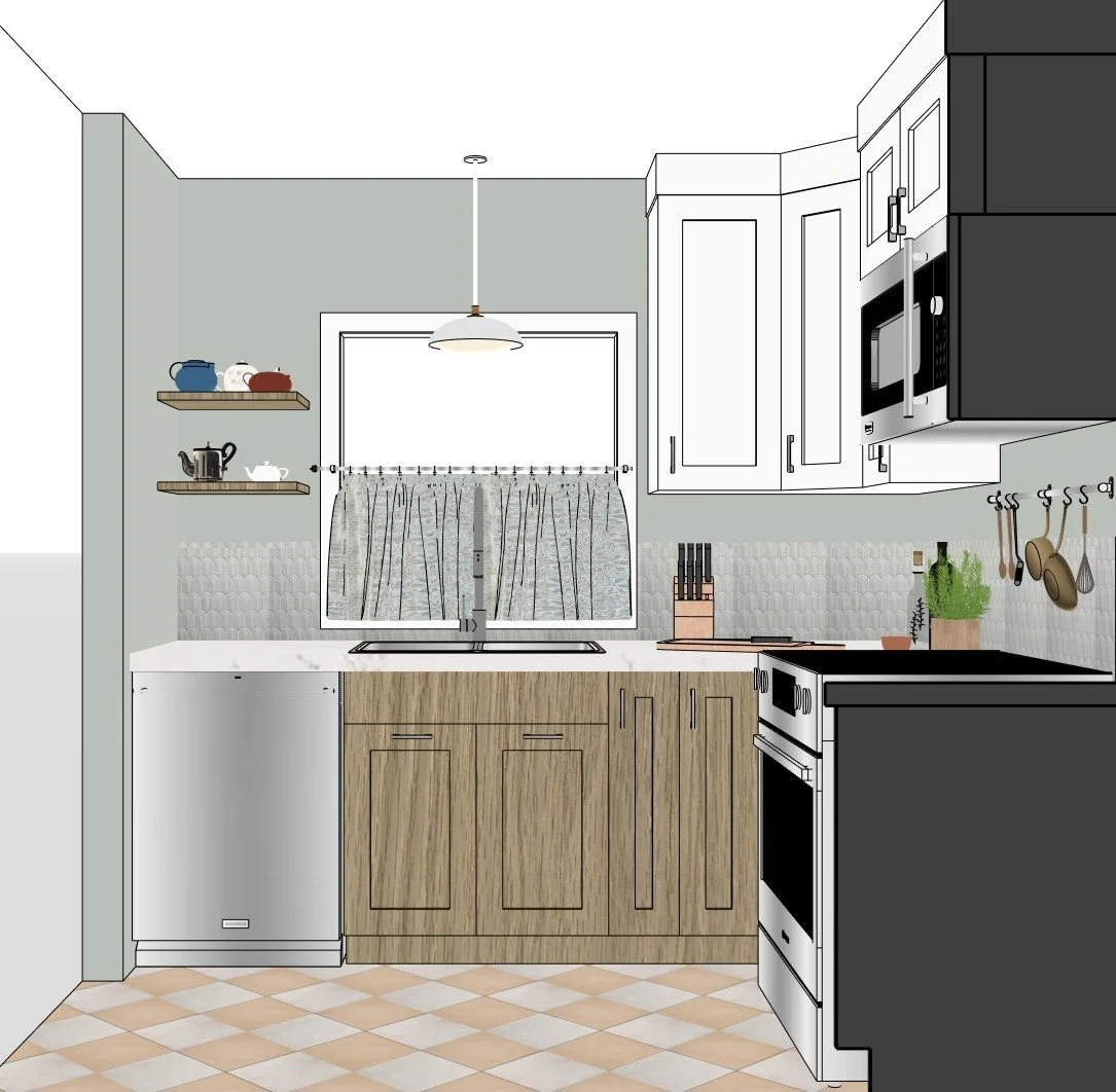
Rendering of the booty bumpin’ Galley kitchen
We loved so many of the rooms, but the winner was the Booty Bumpin' Galley Kitchen. Here are the renderings; Keep reading to hear our thoughts, dilemmas, along with tips and tricks for your own kitchen.....
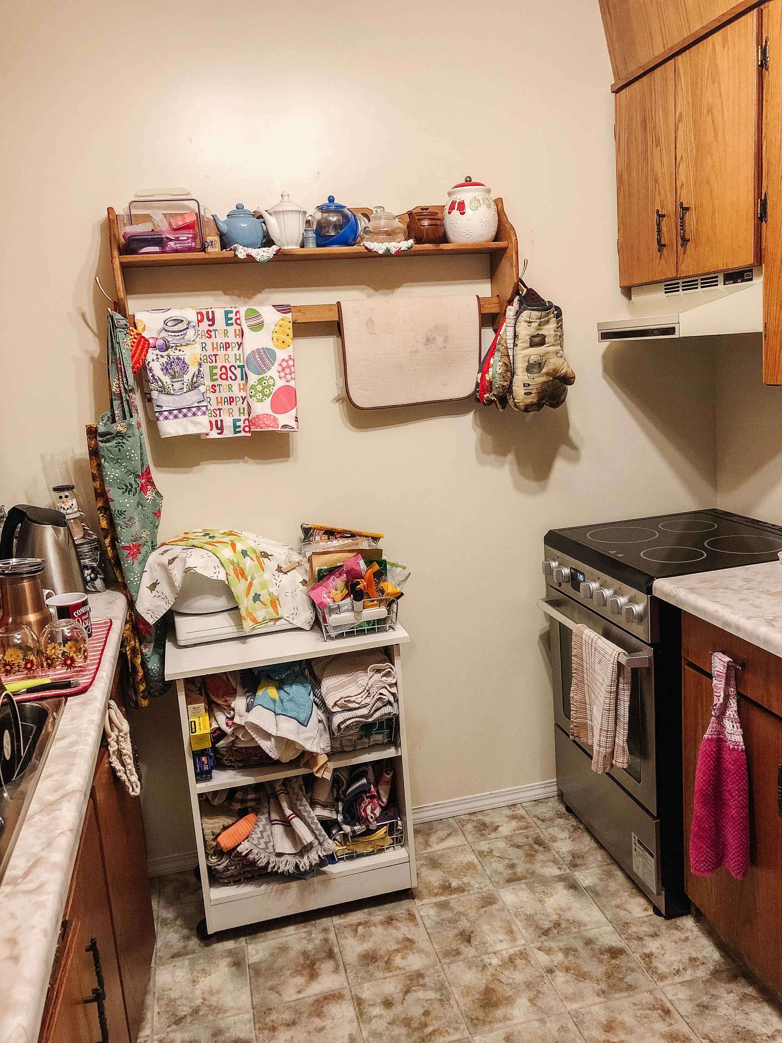
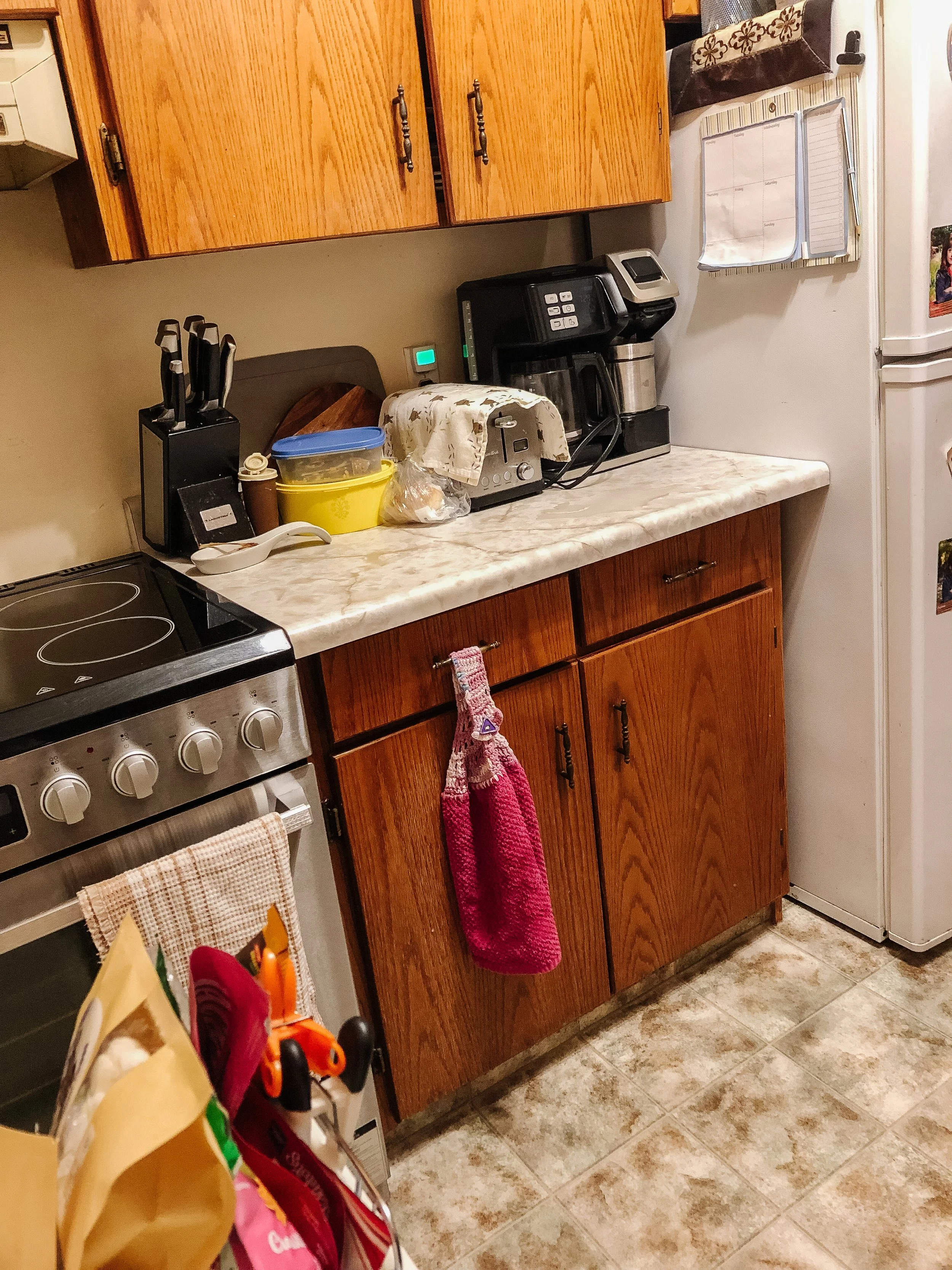
Let’s recap what this kitchen looked like before….


👉 Cabinetry: New cabinetry offers much more efficient storage, so even though the footprint doesn't change much, what can be stored within that footprint will be a larger amount of stuff. We always opt for drawers in the lower cabinetry, and getting 4 drawers in each section gives you much easier access to your stuff. We made the upper cabinetry taller because in a small space you want to use as much vertical space as possible. What about reaching the top shelf? Store things up there that you don't need very often, but still belong in the kitchen. We were able to add the garbage/recycling in the cabinetry (which we always recommend) so the floor space is as un-cluttered as possible.
👉 Floorplan: We went back and forth about whether to keep the galley style, or add cabinetry to the back wall. In the end, using that back wall won over because of what it allowed us to add. Moving the stove gives a larger section of counter space to work on. And it gives us TWO "Super Susans" in the corners that are great for larger things that the won't have to sit on the counters. This also gave us the opportunity to shuffle the sink wall and make space for a dishwasher. That should free up the counter section currently used to dry dishes.


👉 Appliances: We don't usually suggest the microwave above the stove, but in a small space it just make sense to double-down on some of those essentials. We put a counter-depth fridge in our proposal, which is important when you are working with small spaces because having an huge fridge sticking way out into the space feels overwhelming and that's not the feature you want to show-case. Making sure all appliances are the same finish helps the look feel cohesive. Taking everything off your fridge makes a HUGE visual impact on any kitchen -and if you feel there's too much clutter in your kitchen, give that a try!)
👉 Lighting: Making sure the ceiling light is updated and gives good lighting to the room. We always add task lighting in the form of under-cabinet light in the kitchen. Adding a wall light or pendant over the sink adds to both the vibe and functionality of the space.
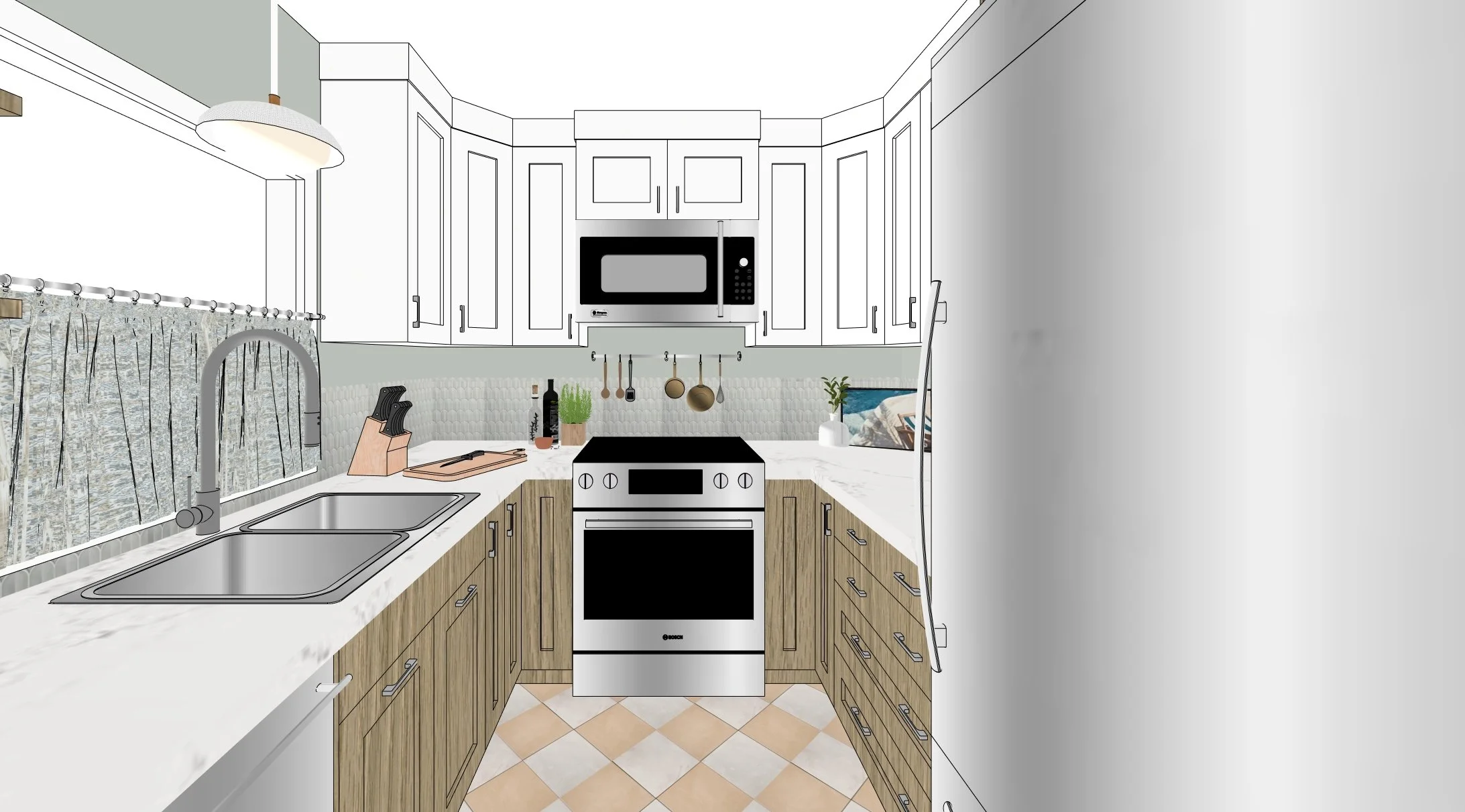

👉 Finishes and colours: We liked the softness of wood but kept it in a lighter stain, and we did all the uppers in a muted white, so the space feels bright and airy. The tile choices we had fun with! The floor is a classic diamond check but with blended colours, and the backsplash we did in a fun scalloped tile, keeping that scalloped shape on the top edge of the backsplash. The wall colour is a slightly lighter version of the backsplash tile so the walls don't end up feeling chopped up (there's not much wall see).
👉 Open shelves: This may seem like a wasted opportunity, but because the space it so small and we added wall cabinets everywhere, it felt nice and open to add shelves left of the window instead. This also gives an opportunity to showcase the cute tea pots currently displayed on the backwall.


👉 Other details: Adding a metal bar on the wall by the stove means you can hang your pots and pans there and free up precious cabinet space. Stacking your cutting boards on the counter (if they're nice) could be another way to free up cabinet space. This could be done in one of the corners which is deeper and tends to end up as "dead space" anyway. Adding a small plant with them makes it feel more like a design moment rather than just stuff sitting in the corner. We hung a cafe curtain in the window which does a few things for the space: get's a softer and more personalized look, gives privacy, and allows the light from the window to bounce off all the light surfaces in the room and makes it feel more spacious and inviting.

The room is now drawing you in, inviting you to come make something amazig!
👉 Construction: We shuffled the window to one side a bit, and made it slightly smaller than the existing one. The reason for this was to make room for a dishwasher and still center the window over the sink. Because this was a small package design consult, we went back and forth on how involved to make the suggestions. Construction like this does create other issues, like opening up the wall and framing for a new window, fixing drywall on the interior and siding on the exterior. We felt it would be worth it in this case because the kitchen gets used E.V.E.R.Y. day! A better kitchen adds resale value to the home and may be worth considering in some cases.
Shop kitchen


Below are the befores and afters.
Again, we had such a hard time picking oNE room; we wanted to do a make-over of every space you submitted!! We love transforming spaces that aren’t working and giving the homeowner a headache. We heard from some of you that you’ve given up, you feel ashamed, there’s no love for that space any longer… And that’s so heart breaking because our homes are where we should be able to unwind and relax…. Don’t fret! Your home CAN be amazing!
All you need is us ;)