
June
By Jessica

It’s hard to believe that June is done and we are heading into July. Hello summertime in Saskatchewan! This time of year is a great time to transition from the inside projects to the outside projects….although I still need to finish up the bathroom project - almost there! It’s time to dream of creating vacation-type backyards and enjoying fires and smores with friends. Hopefully you’ve had a good start to the summer as well.
BUT…If you are working on a project inside, it very well may include paint. When we decided to freshen up our guest room, I wanted to create a relaxing and calm room. But I also wanted it to be a bit different than the rest of my home (which is 99% white). When I came across some photos showing contrasting trim colour, I immediately knew that I wanted to try this in my own home. The guest room was the perfect test spot.

Photo found from I Spy DIY
This was one of the first photos I saw of light walls paired with darker trim, that really made me stop in my tracks. I love the softness the contrasting colours give. One of the things I like about working with white walls, is the versatility they provide for any colours that I’d like to add in with decor and artwork. Adding darker trim takes the room from feeling stark and “too” white, to more balanced and interesting.

Photo found from Studio McGee

Photo found from Chris Loves Julia
I started by painting the walls white. One of my favourite white paints is Cloud White CC-40 by Benjamin Moore. Cloud White sits right in the middle of things with its warm, but still relatively neutral undertones. Not too stark or icy and not too yellow. I then picked the contrasting trim colour. I was after a warm greige (perfect mix of beige and grey), landing me with Pale Oak OC-20 by Benjamin Moore. Pale Oak was the perfect greige for this project because it has just the right amount of warmth in the undertone that it keeps the gray in the color from being too cold and sterile. It definitely leans more towards the warmth of beige than other traditional greiges. And that’s exactly the feel I was going for. Warm and inviting, but still fresh and clean.
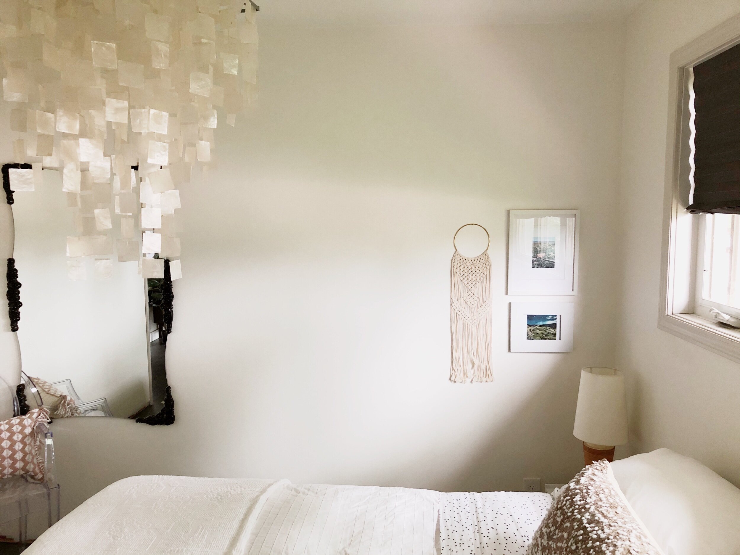
I’m so happy with how it turned out.


What do you think?!
These photos were taken in the morning light so they are definitely more on the warmer side. But I love how paint colours change and give off different hues throughout the day…these two are no exception.
Honestly, I’m so happy with how it turned out and I’m hoping to eventually carry this paint scheme throughout my house. It was a pretty low-risk paint option and it definitely paid off in the end.
Any inside projects that you’ve been working on? Or have they all moved outside? If you have been thinking of trying something new and different in your home, this is for sure a low-risk paint project with an end-result that is just beautiful! (and can be done on rainy summer days)
Here’s to the beginning of summer!